Medosome Biotec
Giving children a better chance at a long and healthy life.

Designs and data have been modified and do not represent real products or systems.
Summary
I transformed a fragmented, spreadsheet‑driven workflow into a unified, real‑time clinical trial oversight platform that gives biotech leadership instant clarity, anytime, anywhere.
Financial loss from missed or late information
Reduction in analysis time
Shorter leadership meetings
Risk awareness through real‑time alerts
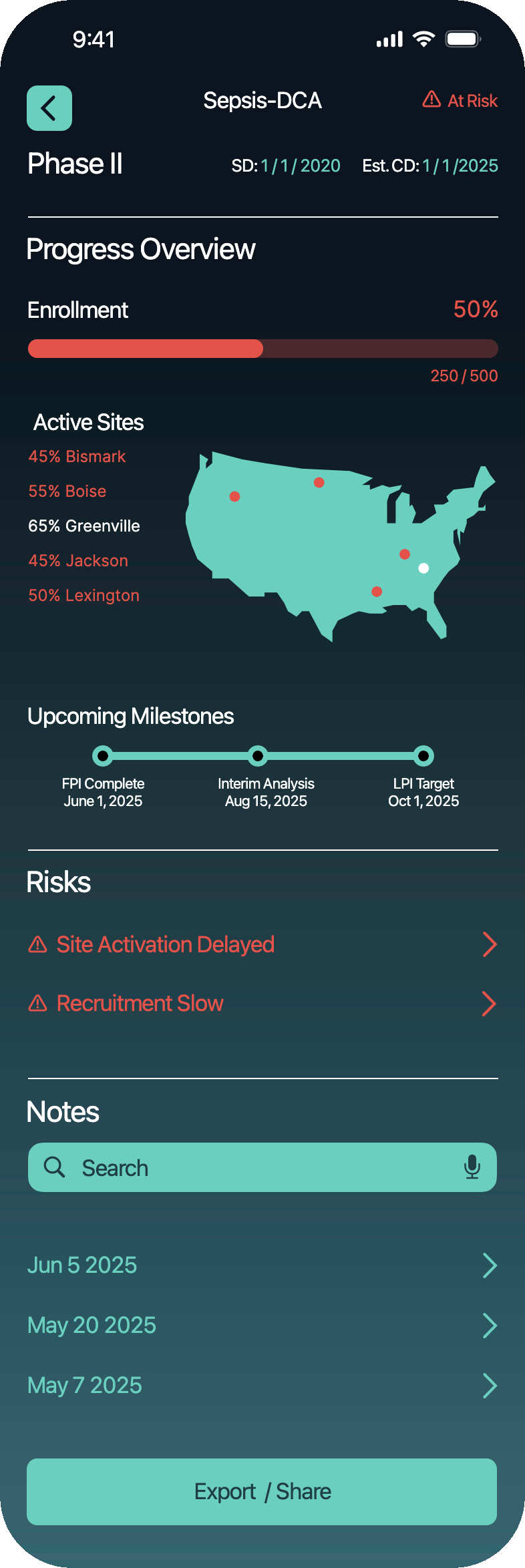
Clinical Trials Dashboard
A mobile‑first command center preventing costly delays before they happen, was needed by Metosome Biotec, a small biotech company that specializes the health challenges faced by children around the world.
My Role
As a Product & UX Designer I
led the project from discovery through delivery, including research, strategy, IA, wireframing, prototyping, usability testing, and UI design.
Platform
Mobile‑first responsive web application
UX Methods
Stakeholder Interviews, Personas, Journey Mapping, Competitive Benchmarking, Information Architecture, Wireframing, Prototyping, Usability Testing
Tools
Figma, Lunacy, Google Suite
A High‑Stakes Problem
Assumption
There are multiple off the shelf solutions for Biotech and the modern workplace offers multiple modes of integration and data management to make executive decisions easier than ever.
Truth
A biotech CEO was losing money, not because trials were failing, but because information was failing. Critical updates were buried in spreadsheets, emails, and PDFs. By the time leadership learned about delays, the damage was already done: missed milestones, shaken investor confidence, and costly setbacks.

Conflict
Medosome Biotec is a small company in a saturated space, so custom software would have to be produced and a minimal cost, can we produce a solution better than the multiple products on the market?
Clinical trials move fast, and fall apart even faster when leadership doesn’t have the right information at the right time.
Rich
The CEO

Age 62
"I need to see what’s at risk before it becomes a problem; not after."
Description
Rich leads a mid-sized biotech firm with several active clinical trials. A former scientist turned executive, he’s strategic, analytical, and time-starved. He travels often to pitch investors, meet with regulators, and manage high-stakes partnerships.
Objectives
Stay informed on all trial statuses at a glance
Identify red flags without wading through emails or spreadsheets
Report confidently to investors and the board
Motivations
Being proactive, not reactive
Leading with data-backed confidence
Protecting financial and scientific investments
Frustrations
Data is scattered
Updates are too detailed or technical
Important risks are buried or missed entirely
What is Leadership Experiencing?
Observation and having research and leadership walk me through their process I uncovered forces driving the crisis:

Fragmented Information Across Spreadsheets
Trial data lived in: Multiple Excel Sheets, Email Chains and Texts; nothing was centralized. Nothing was real‑time. Everything required digging. This fragmentation meant the CEO often learned about issues only after they had already escalated.
Overwhelming, Dense Reporting
"I don’t have time to read through rows of data to find what matters."
Important insights were buried in noise. Risks were easy to miss.
It’s not a lack of ability; it’s a lack of translation.
Delayed Awareness of Problems
By the time leadership discovered a delay: slow enrollment, site activation issues, missed milestones, it was already expensive.
The cost wasn’t limited to time lost; it eroded confidence with investors and partners.

Communication Bottlenecks
Operations managers and project leads were flagging issues, but through channels that weren’t built for urgency. Leadership wasn’t ignoring problems; they simply weren’t seeing them in time.
Overarching Driver
Biotech leadership needs real‑time clarity, not after‑the‑fact reporting.
The problems wasn’t our trials were failing.
The problem was our information was failing.

Root Cause
Biotech leadership needs real‑time clarity, not after‑the‑fact reporting. The company wasn't facing crises because trials were failing, it was losing money because information was failing.
Problem Statement
How Might We enable a Life Sciences executive a single place for clinical trial data (as opposed to multiple computers or multiple screens) so that they can finally see every clinical trial clearly, catch risks before they become crises, and make confident, company‑shaping decisions anywhere, anytime?